Jump to: Chart Container | Chart Grid | Legends | Tooltips | Annotations
Chart Container
This section defines the spacing and styling of titles, subtitles, and notes/sources. It also includes specifications for chart containers across different sizes and external exports.
Chart Sizes
The design system defines 3 ranges of chart sizes. These different container sizes determine the font sizes and spaces used in the layouts. In larger charts larger font sizes and spaces are used. On this page, font and space sizes are provided with names (xxs-xl). To find the size in pixels, refer to the Typography page.
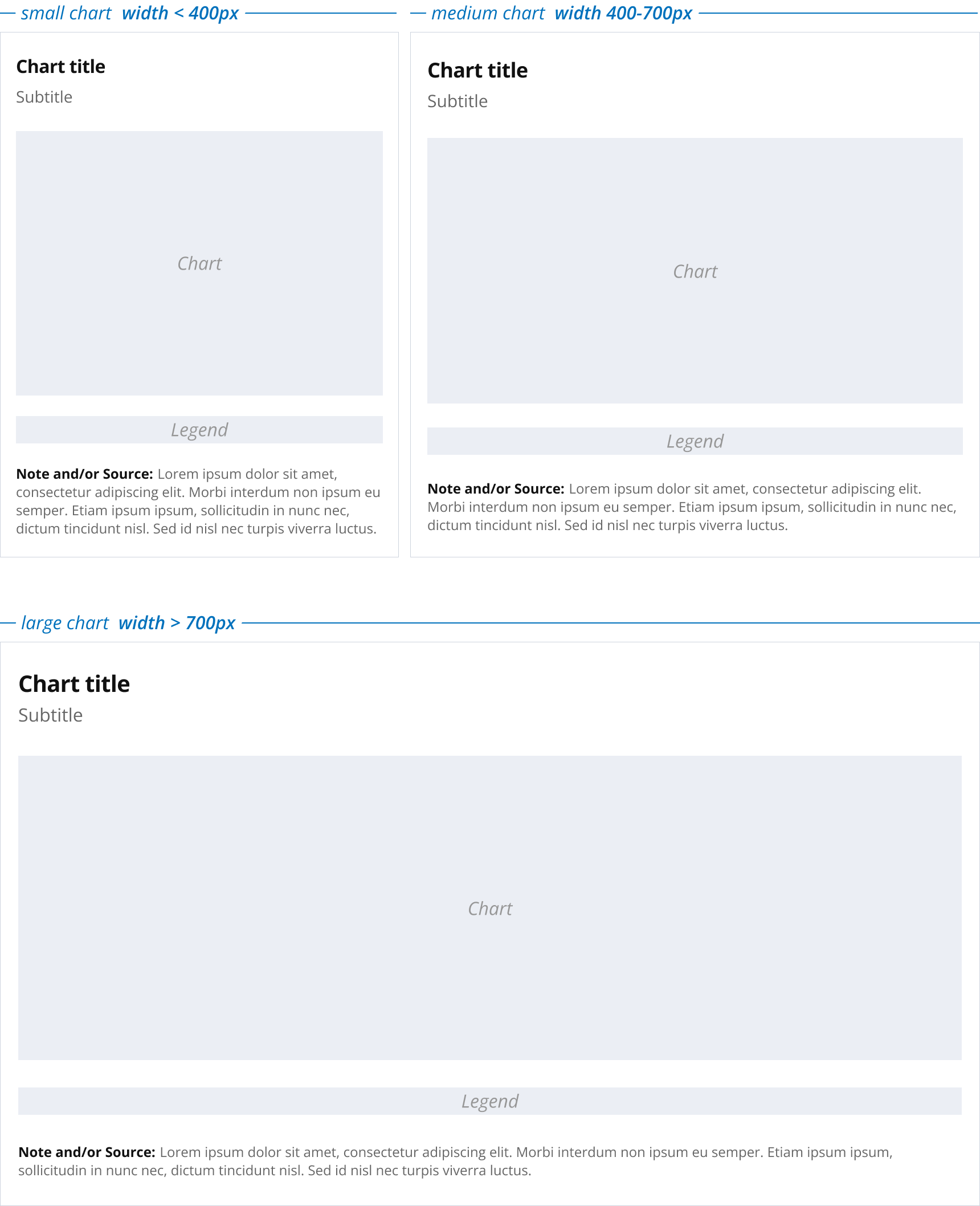
Container Layout and Typography
Spacing and font sizes are defined relative to the size of the visualization container. You can find the font sizes and spaces on the typography page.
chart title
size
l
weight
bold
height
120%
color
text
subtitle
size
m
weight
regular
height
120%
color
textSubtle
note title
size
s
weight
bold
height
150%
color
text
note
size
s
weight
regular
height
150%
color
textSubtle
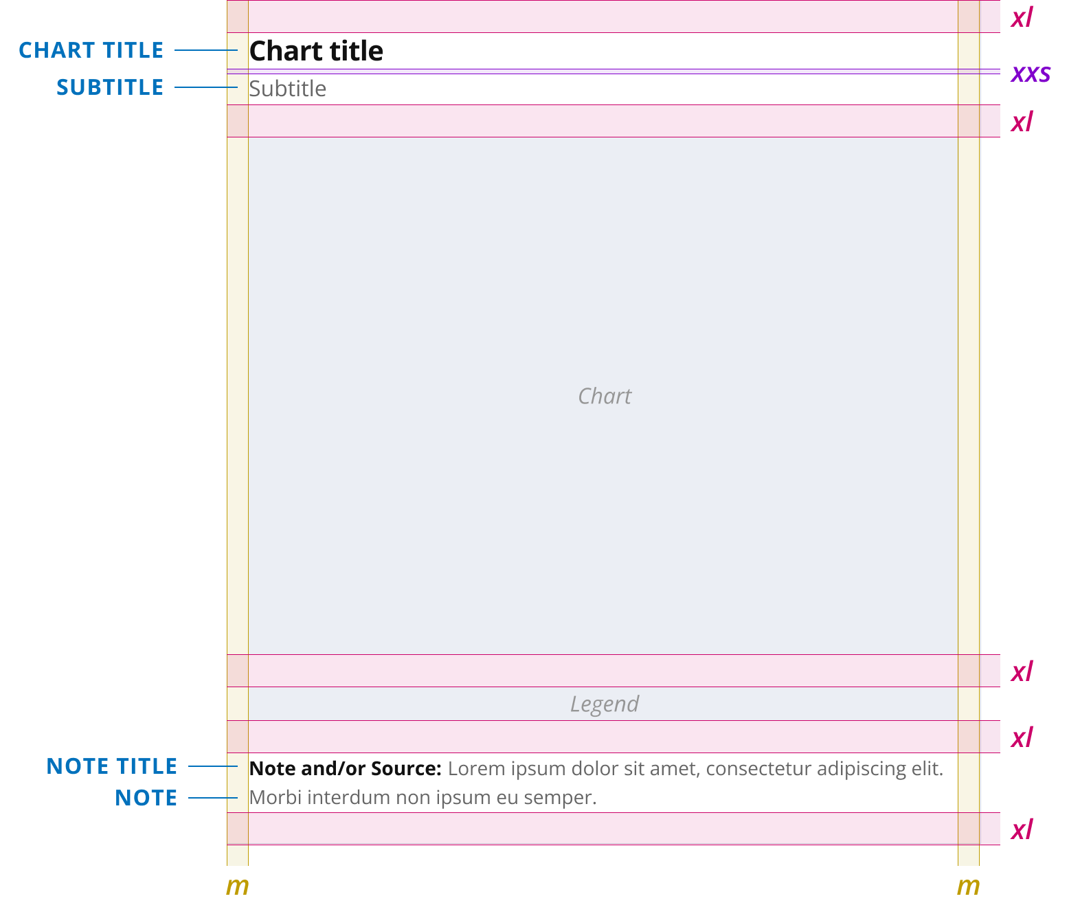
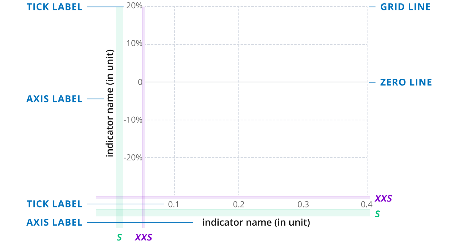
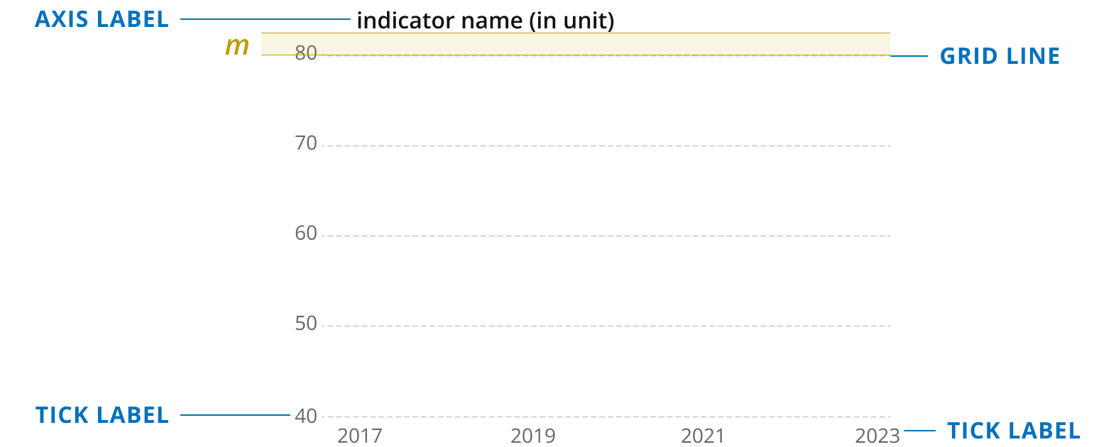
Chart Grid
Chart grids are standardized across different chart types (scatterplots, line charts, bar charts), ensuring consistent styling for grid lines, tick labels, and axis labels. While individual elements remain the same, variations are detailed in this section.
Chart grid rules and styles
Chart grids are used in different chart types and situations. Style guide users should try to adjust the number of ticks on each axis so as to place about 5 ticks on each axis. The numbers on axis should be rounded if possible. In general, only use axis labels where necessary (i.e. whenever the indicator name is not apparent from the title of the chart or when using two numeric axes). For temporal axes, no axis labels are required as years are clearly recognizable as such.
axis label
size
s
weight
semibold
height
120%
color
text
tick label
size
s
weight
regular
height
120%
color
textSubtle
grid line
color
grey200
linewidth
1px
dash
4 2
zero line
color
grey300
linewidth
1px
Two numeric axes (e.g. Scatterplot)
One temporal and one numeric axis (e.g. Trend/Line Charts)
No axis label and tick marks should be used for the temporal axis to avoid visual clutter and to make the values on the y-axis easier to read.
Single numeric axis (e.g. Bar Chart)

Legends
Legends can be used whenever direct labeling is not possible (e.g. in maps or scatterplots). The style guide defines categorical legends and numeric legends for color scales. There are two types of numeric legends depending on whether the values are mapped to colors continuously or in fixed value bins.
Categorical Legends
Categorical legends are used for visualizations mapping data categories (e.g. regions, income groups but also other categories) to color. Do not use them if you can label your data points directly with the categories.
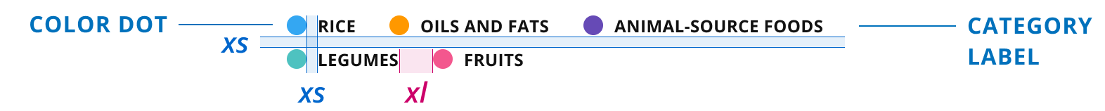
color dot
width
14px
height
14px
category label
size
s
weight
semibold
height
120%
color
text
style
uppercase
Binned Numeric Legends
Only use rounded and scaled numbers for bins. Use only as many digits behind the point as needed to show differences between bins. For number scaling see the Typography and Text page.
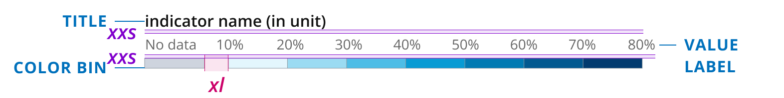
title
size
s
weight
semibold
height
120%
color
text
color bin
height
10px
width
auto
borderWidth
0.5px
borderColor
grey300
value label
size
s
weight
regular
height
120%
color
textSubtle
Numeric Legends
Use this type of legend if you are mapping your data values to a continuous color scale. The ticks on this legend should always use rounded and scaled numbers. For number scaling see the Typography and Text page. Make sure to always label the color mid-point in a diverging color scale.
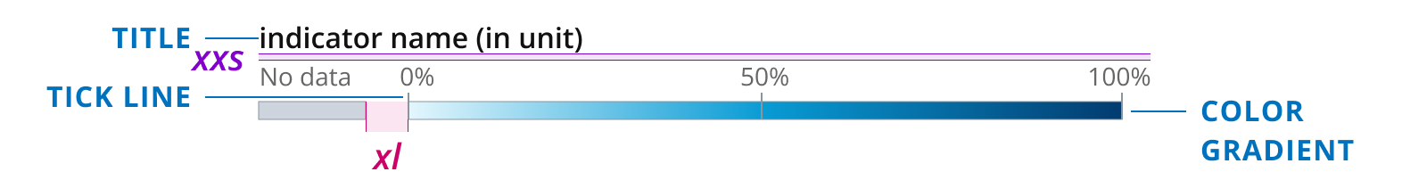
title
size
s
weight
semibold
height
120%
color
text
value label
size
s
weight
regular
height
120%
color
textSubtle
tick line
color
grey300
linewidth
1px
height
14px
gradient
height
10px
width
auto
borderWidth
0.5px
borderColor
grey300
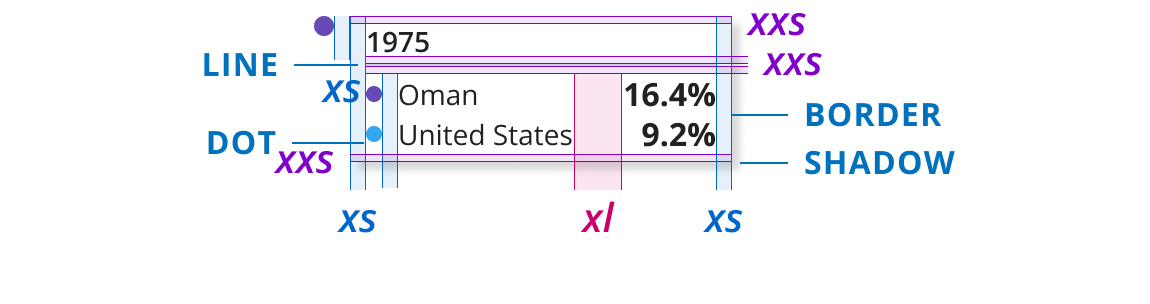
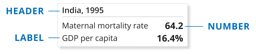
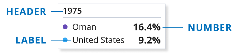
Tooltips
Tooltips can be used to interactively explore values within a chart. The style guide describes different types of tooltips that can be used in various chart types. This section describes a general tooltip style and some situation specific tooltip styles.
Tooltips layout and common styles
This section describes the layout of a general tooltip including colors, fonts, and spacing. These styles are kept consistent across all types of tooltips.
dot
width
8px
height
8px
line
color
grey200
linewidth
1px
border
border
grey200
linewidth
0.5px
shadow
xOffset
4px
yOffset
4px
blurRadius
4px
color
grey500
alpha
0.15
header
size
s
weight
semiBold
height
120%
color
text
label
size
s
weight
regular
height
120%
color
text
number
size
m
weight
bold
height
120%
color
text
Simple tooltips (e.g. maps, beeswarms)

Tooltips with multiple values (e.g. in scatterplots)
Tooltips with multiple categories (e.g. linecharts)
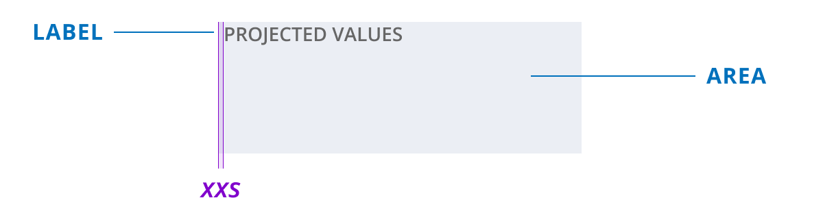
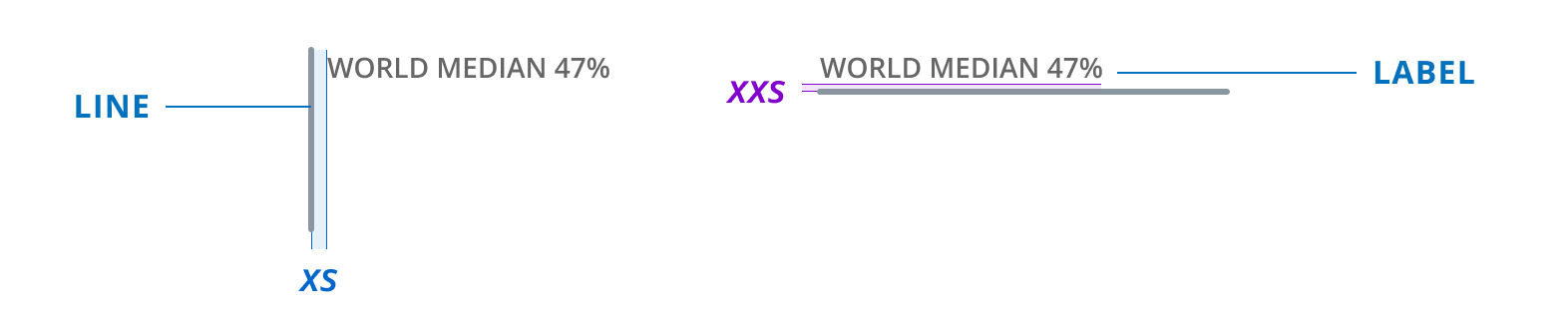
Annotations
Annotations can be used in charts to add benchmark lines or highlight specific areas. This section describes the styling of annotations in charts.
Styles for annotations
This section defines label, line, and color styles for annotation lines and areas.
label
size
s
weight
semiBold
height
120%
color
textSubtle
style
uppercase
line
color
reference
lineWidth
3px
area
color
grey200
Line annotations
Line annotations can be used to mark benchmarks or other values in a chart. A horizontal as well as a vertical line annotation is available to highlight values on both the x- and y-axis.
Area annotations
Area annotations can highlight an entire area in a chart. Annotation areas should always be drawn below other chart elements as not to overlap chart grids, lines etc.