Jump to: Line Charts | Scatterplots | Beeswarms | Bar Charts | Maps
Line Charts
Use line charts to display temporal trends. If more than 5 lines are shown together, keep one line focused and show the others in a more subtle style as background information.
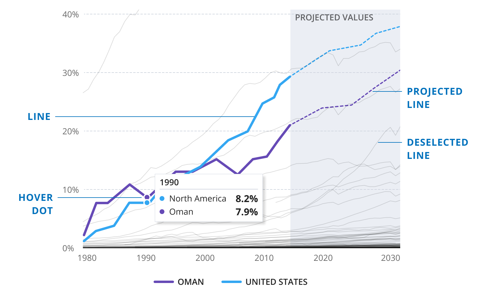
line
stroke
4px
lineCap
round
join
round
projected
stroke
2px
lineCap
round
join
round
dash
2 2
deselected
stroke
1px
color
grey500
alpha
0.15
hover dot
width
8px
height
8px
border
2px
borderColor
white
Scatterplots
Scatterplots are used to show the relationship between two indicators.
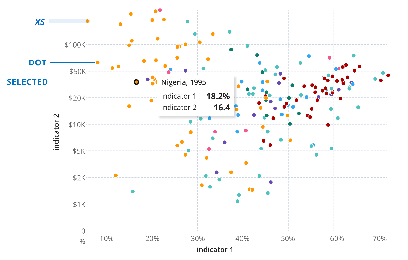
outline
stroke
1px
color
white
selected
stroke
2.5px
color
grey500
Beeswarms
Use beeswarms to show the value distribution of a single indicator.
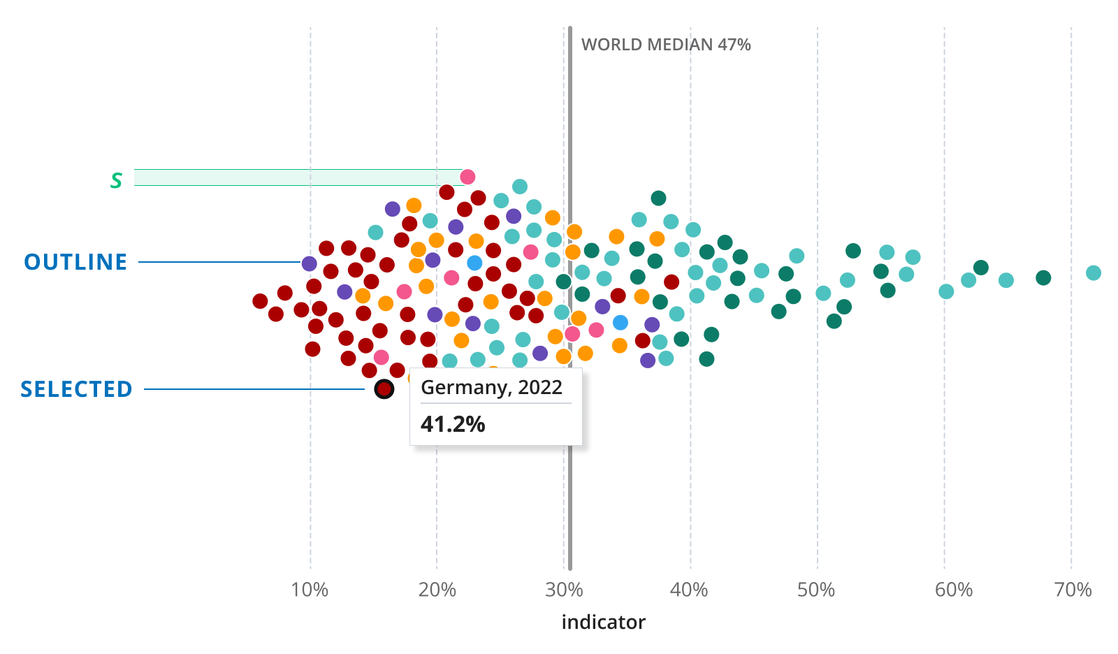
outline
stroke
1px
color
white
selected
stroke
2.5px
color
grey500
Bar Charts
Bar charts are great for showing a ranking or comparing values.
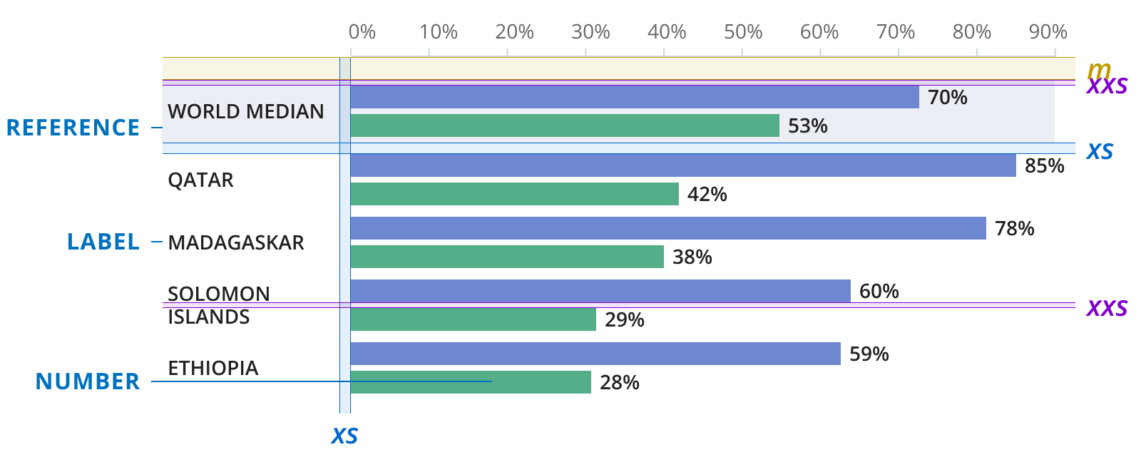
reference
bgColor
grey100
label
size
s
weight
semibold
height
120%
color
text
style
uppercase
number
size
s
weight
semibold
height
120%
color
text
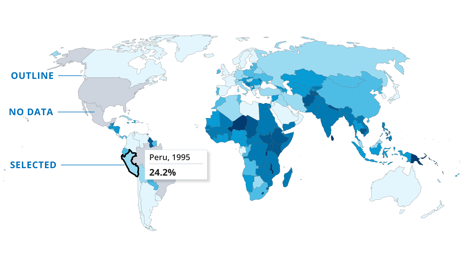
Maps
The World Bank has a separate style guide for maps. This section only contains additional style definitions for interactive maps. Please find additional details for maps here. To get clearance for maps, please reach out to mapclearance@worldbank.org.
outline
stroke
0.3px
color
grey400
lineCap
round
join
round
no data
color
noData
selected
stroke
2.5px
color
grey500
lineCap
round
join
round